Redesign the admin page #414

Closed
opened 2026-11-07 08:54:25 -08:00 by rays · 2 comments
Owner

The admin page (Server, Accounts, Directory, Log) has grown one field at a time:

  • At 390 px the section tabs run off the right edge; Log is cut off.
  • Server is one long column of eleven settings, each a full-width box, even for a one-digit number, with units and the meaning of 0 in the label, and a paragraph of hint under most. On a desktop the number boxes are 1150 px wide.
  • Directory puts its Save between the connection settings and the Servers and Blocked lists, and its status reads like a field.
  • The log's toolbar takes three rows on a phone, and its explanation is a paragraph under the box.
  • Every section's headings look alike, so nothing groups related settings.

Mockups go here for approval before anything is merged.

The admin page (Server, Accounts, Directory, Log) has grown one field at a time: - At 390 px the section tabs run off the right edge; Log is cut off. - Server is one long column of eleven settings, each a full-width box, even for a one-digit number, with units and the meaning of 0 in the label, and a paragraph of hint under most. On a desktop the number boxes are 1150 px wide. - Directory puts its Save between the connection settings and the Servers and Blocked lists, and its status reads like a field. - The log's toolbar takes three rows on a phone, and its explanation is a paragraph under the box. - Every section's headings look alike, so nothing groups related settings. Mockups go here for approval before anything is merged.
rays added the enhancement label 2026-11-07 08:54:25 -08:00
Author
Owner

Prototype on branch admin-redesign (not merged, not deployed). Screenshots from a scratch daemon, Glass dark unless noted.

What changes

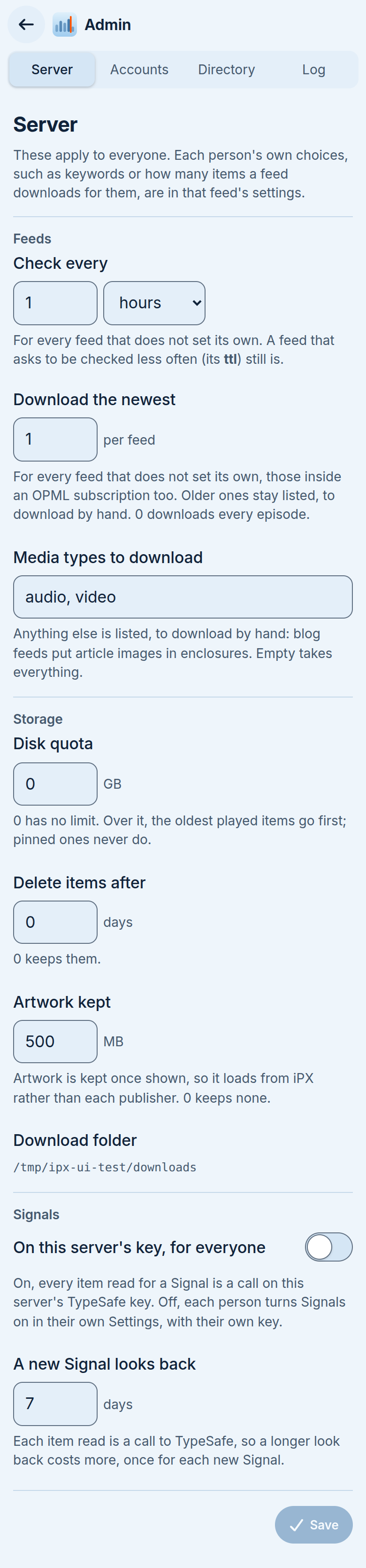
  • Same layout as a feed's settings (#290). Each tab is split into named parts (Server: Feeds, Storage, Signals; Accounts: People, Add someone; Directory: Connection, Servers, Blocked), the name in a column beside the controls on a desktop and above them on a phone.
  • Numbers say their unit after the box ([0] GB, [7] days) instead of in the label, and the box is number-sized. What 0 means is in the caption.
  • Switches instead of checkboxes, as in a feed's settings: Signals on the server's key, Share public feeds, Admin on each account and for someone new.
  • Server's Save stays on screen at the foot, and is greyed until something changes.
  • Phone header: the four tabs take a row of their own, so Log is no longer cut off.
  • Accounts: the Proxy tag sits by the name instead of between the name and the Admin switch; long names wrap without pushing the controls about.
  • Directory: its status is a box at the top, saying how the directory answers before the settings that change it; Save is the end of Connection, ruled off from Servers and Blocked.
  • Log: source tabs beside the heading, level, filter, Follow and copy in one bar; the box fills the screen's height; each tab's explanation is its tooltip instead of a paragraph. On a phone each line is time and level, then the message, with a rule between lines.
  • Captions shortened throughout. Nothing changes on the server, and no theme colours change.

Before (390 px)

Server Accounts Directory Log

After (390 px)

Server Accounts Directory Log

Accounts after has an admin (alex), two proxy accounts (jordan, and casey.morgan@example.com for a long name) and a regular one with a password (sam). Before had only the one admin.

Modern light, Server:
After, desktop (1280 px)

Server
Accounts
Log

Yours to decide

  1. Save on Server greyed until something changes, or always lit?
  2. The account row's Admin switch keeps its word "Admin" beside it; drop it on a phone (the switch still has its name for a screen reader)?
  3. Anything to move between tabs, e.g. the Signals settings to a tab of their own?
Prototype on branch `admin-redesign` (not merged, not deployed). Screenshots from a scratch daemon, Glass dark unless noted. ## What changes - **Same layout as a feed's settings (#290).** Each tab is split into named parts (Server: Feeds, Storage, Signals; Accounts: People, Add someone; Directory: Connection, Servers, Blocked), the name in a column beside the controls on a desktop and above them on a phone. - **Numbers say their unit after the box** (`[0] GB`, `[7] days`) instead of in the label, and the box is number-sized. What 0 means is in the caption. - **Switches instead of checkboxes**, as in a feed's settings: Signals on the server's key, Share public feeds, Admin on each account and for someone new. - **Server's Save stays on screen** at the foot, and is greyed until something changes. - **Phone header:** the four tabs take a row of their own, so Log is no longer cut off. - **Accounts:** the Proxy tag sits by the name instead of between the name and the Admin switch; long names wrap without pushing the controls about. - **Directory:** its status is a box at the top, saying how the directory answers before the settings that change it; Save is the end of Connection, ruled off from Servers and Blocked. - **Log:** source tabs beside the heading, level, filter, Follow and copy in one bar; the box fills the screen's height; each tab's explanation is its tooltip instead of a paragraph. On a phone each line is time and level, then the message, with a rule between lines. - Captions shortened throughout. Nothing changes on the server, and no theme colours change. ## Before (390 px) | Server | Accounts | Directory | Log | |---|---|---|---| | ![](https://git.sdf1.net/attachments/93b7ec14-4f69-4288-8e53-4094fba34193) | ![](https://git.sdf1.net/attachments/a26641e1-b015-483a-9cd4-939648ae5562) | ![](https://git.sdf1.net/attachments/bb9f181b-24bf-4970-9671-323f5ea028df) | ![](https://git.sdf1.net/attachments/4440659f-95d8-466c-98b4-761dff880852) | ## After (390 px) | Server | Accounts | Directory | Log | |---|---|---|---| | ![](https://git.sdf1.net/attachments/5fc568be-628d-4235-9141-6f01c3675473) | ![](https://git.sdf1.net/attachments/62e83a36-8622-4e24-946d-36e20d34daed) | ![](https://git.sdf1.net/attachments/1d8ba521-333c-48f4-932e-a9142b83bee8) | ![](https://git.sdf1.net/attachments/0314c31d-ae6b-4541-87cd-f027eb102653) | Accounts after has an admin (alex), two proxy accounts (jordan, and casey.morgan@example.com for a long name) and a regular one with a password (sam). Before had only the one admin. Modern light, Server: ![](https://git.sdf1.net/attachments/a8d9fb46-1fcd-4f09-a68a-c299e002de7a) ## After, desktop (1280 px) ![Server](https://git.sdf1.net/attachments/1bbea87c-a7d8-4579-a808-eb18e40e1b7b) ![Accounts](https://git.sdf1.net/attachments/48bedc45-888f-4222-8322-daf605ec54e5) ![Log](https://git.sdf1.net/attachments/1e0c292c-16a0-4f18-af1e-22d7749c023b) ## Yours to decide 1. Save on Server greyed until something changes, or always lit? 2. The account row's Admin switch keeps its word "Admin" beside it; drop it on a phone (the switch still has its name for a screen reader)? 3. Anything to move between tabs, e.g. the Signals settings to a tab of their own?
Author
Owner

Merged and deployed in c6dcb7f and b209f55, with the defaults from the mockup comment: Save on Server greyed until something changes, Admin kept beside each account's switch, nothing moved between tabs. Tests: Save waits for a change; at 390 px the tabs and account rows fit. Checked at 390 px in all 25 palettes (Classic draws switches as checkboxes, as it does in a feed's settings).

Merged and deployed in c6dcb7f and b209f55, with the defaults from the mockup comment: Save on Server greyed until something changes, Admin kept beside each account's switch, nothing moved between tabs. Tests: Save waits for a change; at 390 px the tabs and account rows fit. Checked at 390 px in all 25 palettes (Classic draws switches as checkboxes, as it does in a feed's settings).
rays closed this issue 2026-11-07 09:39:02 -08:00
Sign in to join this conversation.
1 Participants
Notifications
Due Date
No due date set.
Dependencies

No dependencies set.

Reference: rays/ipx#414